TabbitBlog

Are Vertical Tabs Better? Pros, Cons, and When to Switch

Compare vertical vs horizontal tabs, when each layout wins, and a Tabbit workflow that keeps titles readable on a busy desktop.

In this article
  1. Key takeaways
  2. Vertical vs horizontal tabs at a glance
  3. Why a side list is easier when you keep many tabs
  4. When the top bar is still the better layout
  5. How Chrome, Edge, Firefox, and Safari actually ship this
  6. The annoying parts: hover expand, muscle memory, and small screens
  7. A tab-heavy workflow that uses the side list well
  8. A practical option for tab-heavy work: Tabbit Browser
  9. Which layout fits which job
  10. Final verdict

A Reddit thread asked a blunt question: why do so many people use vertical tabs when they eat extra screen? The original poster found the side rail "less convenient and more hectic." Replies kept landing on the same failure in the old top bar. Keep more than a handful of pages and horizontal tabs stop being a list. They become a row of icons. One comment put it plainly: it is better "to see all of your open websites WITH their names and just scroll through them in a list rather than just having a lot of small icons stacked up in a horizontal bar."

You are not hunting for prettier chrome. You cannot tell the live form from last week's docs from a duplicate search. Tabbit Browser shows up later as a side list that still lets you group work, and switch that window back to a top bar when it needs the width.

Key takeaways

  • Vertical tabs are better when titles on the top strip are no longer readable. They are not better as a personality trait.

  • Wide monitors usually have leftover width. Web pages are tall. Putting the tab list on the side often gives you more of the page, not less.

  • Two windows side by side, a 13-inch laptop, or a short working set can still be happier with a thin top bar.

  • Chrome shipped native vertical tabs in April 2026. Firefox, Edge, and Vivaldi already had their own versions, and the hover behavior is not identical.

  • A side list does not save RAM and does not replace a retrieval system. Pair it with groups, a later queue, and a place for durable links.

Vertical vs horizontal tabs at a glance

DimensionHorizontal tabsVertical tabsWho this matters for
Title visibilityEach new tab steals width until only a favicon remainsTitles stay a readable line; you scroll the listAnyone who keeps more than about a dozen pages
Screen geometryUses scarce vertical pixels for a strip you barely readUses leftover width that many sites leave as paddingWidescreen and ultrawide desktops
DensityFine for 4 to 8 tabs; collapses under a research pileMore labels fit before you must huntTab-heavy research, support, shopping
Split windowsA thin top bar leaves width for two documentsA persistent sidebar can squeeze each paneDesign, sheets, side-by-side docs
Muscle memoryDecades of looking at the topA few days of looking leftAnyone switching in 2026
Memory and CPUUnrelated to strip positionUnrelated to strip positionPeople blaming the layout for RAM

Microsoft's own vertical vs horizontal guide is one of the few official pages that lists both sides. It also tells widescreen users the top bar may fit them better. That advice collides with how most sites are built. A maximized wide window has leftover width. Two windows sharing that width do not.

Why a side list is easier when you keep many tabs

Web pages scroll down. Monitors are wide. The Verge's 2026 argument is mostly geometry: the tab strip should not spend the short axis of the screen on labels you cannot read. On a 13-inch laptop, a crowded top bar can shrink a title to a few characters while a side list still shows a couple of dozen full names.

Google shipped the same idea into stable Chrome. On 7 April 2026, Chrome's blog added native vertical tabs for people who keep a two-digit tab count, with a right-click control to show tabs on the side. Current Chrome tab help now documents pinning, groups, Tab Search, and showing tabs vertically in one article. If you only need the click path, use the vertical tabs in Chrome guide.

Grouping is the part a top bar still does poorly. Collapsed groups fight for a few pixels. In a side list, a named group is a heading you can open or ignore. A Chrome tab-group walkthrough gets more useful after the strip is vertical, because you can read the group name and the page names together.

Retrieval inside the current window gets quieter too. Tab Search still helps. A readable list means you often skip it. You scroll to Q3 pricing instead of guessing which blue icon is the spreadsheet.

None of this organizes the pile. Carnegie Mellon researchers studying tab overload found that people keep pages because they fear a "black hole" once something leaves the screen. A side list makes the pile legible. It does not decide what should stay a tab, go to a later queue, or become a bookmark. That job belongs to a system for too many browser tabs.

When the top bar is still the better layout

Vertical tabs have a cost: they spend width. On a maximized ultrawide, that width was often empty padding, so the trade is cheap. On a 13-inch laptop with two windows, the same sidebar steals the space you bought the split for.

Keep or return to horizontal tabs when:

  • The working set is short enough that every title is already readable on top.

  • You are comparing two documents, a design file and a spec, or a sheet and a dashboard.

  • You are presenting or screen-sharing and the audience expects a familiar top bar.

  • The site is itself a wide app (Figma, a video timeline, a dense admin table) and every extra column matters.

A YouTube creator at The Linux Cast titled a video "Should You Use Vertical Tabs?" and answered in the description: vertical tabs are not for him, and neither is Zen Browser. Plenty of people try the layout and go back. MakeUseOf's one-week Vivaldi experiment is closer to what converts actually report. The author did not get faster. The session felt calmer because the mystery-meat icons went away. Calmer is worth something. It is still a bad reason to force a sidebar on a window that needs width.

Read Microsoft's widescreen note as a split-window note and it holds. A 34-inch monitor running one browser window has leftover width; put the tabs there. The same monitor running browser plus editor side by side is suddenly a pair of narrow laptops. Use the top bar in those panes, or collapse the sidebar.

How Chrome, Edge, Firefox, and Safari actually ship this

Do not treat "vertical tabs" as one feature. The label is shared. The hover target, the collapsed width, and whether the address bar moves are not.

BrowserNative side listHow you turn it onWhat to watch
Google ChromeYes, stable, April 2026Right-click the tab strip → Show Tabs Vertically; or Settings → Appearance → Tab positionOlder Canary-only reviews are stale; details in /vertical-tabs-chrome
Microsoft EdgeYes, for yearsTab Actions / Search tabs control; shortcut Ctrl+Shift+, on the feature pageSleeping tabs go grey; hover is often described as tighter than Firefox
FirefoxYes, Firefox 136+Settings → General → Browser layout; see the Firefox vertical tabs pageExpand-on-hover can feel too eager; some users disable sidebar animation
VivaldiYesTab Bar Position: Left / Right / Top / Bottom in Vivaldi HelpSidebar can shrink to favicons; high customization
SafariPartialSidebar for Tab Groups, not the same always-on stripIf you want a persistent list of every page, this is the weak match
Workspace browsers (Arc-style, Zen, Tabbit)Usually defaultBuilt into the windowYou are choosing a workspace model, not only a strip direction; see browsers with Arc-style workspaces

If the question is which browser even has a side list, that is a different article: the browser with vertical tabs page and the vertical tabs browser overview. This piece stops at layout. The vertical tabs page is the shorter product version.

The annoying parts: hover expand, muscle memory, and small screens

A readable list can still be a bad afternoon if the collapsed mode is twitchy. One Firefox user already liked Edge's side tabs. After Firefox shipped its own version, the collapsed bar kept opening when the pointer was merely near the left edge:

Mozilla's own notes on how Firefox vertical tabs landed mention community pushback on hover expand and auto-collapse. Mozilla Connect still has threads calling the hover too sensitive. If this is your daily irritation, pin the sidebar open, or use a browser whose hover hit-box is smaller. Readable titles are still worth keeping.

The other cost is habit. On 7 August 2026, George Zarebski wrote that he had been against Chrome's vertical tabs, then used them, and found the hurdle was muscle memory: "Years of looking to the top of the browser and scanning tabs left to right doesn't disappear in 24 minutes." Give the layout a few workdays in one window, not a 20-minute trial during a demo. Hating it in a split-view window teaches you nothing about a research pile.

Small screens remain the honest downside in MakeUseOf's week with Vivaldi and in the Reddit thread's laptop comments. A side list that cannot collapse is a tax. Most people who keep vertical tabs on a notebook collapse them to icons and expand on a precise hover.

A tab-heavy workflow that uses the side list well

Changing the strip direction without changing habits just moves the mess 90 degrees. A typical vendor-research afternoon looks like this: three quote pages, two spec PDFs, a Gmail thread, a music tab, and twelve "maybe useful" articles. Pin Gmail and the music tab. Name one group Vendor quotes and put only the pages that affect the decision. Collapse the article pile or send it to a later queue. If you then open a Figma file next to the spec, collapse the sidebar or switch that window to a top bar. The research window can stay vertical.

For a busy desktop session in any browser:

  1. Turn on a side list in the browser you already use. Confirm you can read titles at your usual tab count.

  2. Pin the two or three pages that must never hide (mail, music, the live form). Pinning still works in a vertical rail.

  3. Put today's outcome in one named group. Vendor quotes is a group. Work is not.

  4. Collapse groups you will not touch for an hour. The point of a side list is that collapsed names stay words.

  5. Keep a later queue for one-off articles. Close those live tabs after they are saved. The too many tabs system covers that split.

  6. Leave playing media and unfinished forms alone. Tab sleeping is a different switch; see tab sleeping vs active work.

  7. If a window needs width, collapse the sidebar or switch that window back to a top bar. Do not treat the choice as permanent.

This workflow is browser-agnostic. Chrome, Edge, and Firefox can all do the first six steps. The browser productivity setup is the wider version if you also care about search, blocking, and session restore.

A practical option for tab-heavy work: Tabbit Browser

Native vertical tabs solve visibility. They do not sort a mixed pile, and they do not give you a project box you can reopen tomorrow. That is the gap Tabbit Browser is built around.

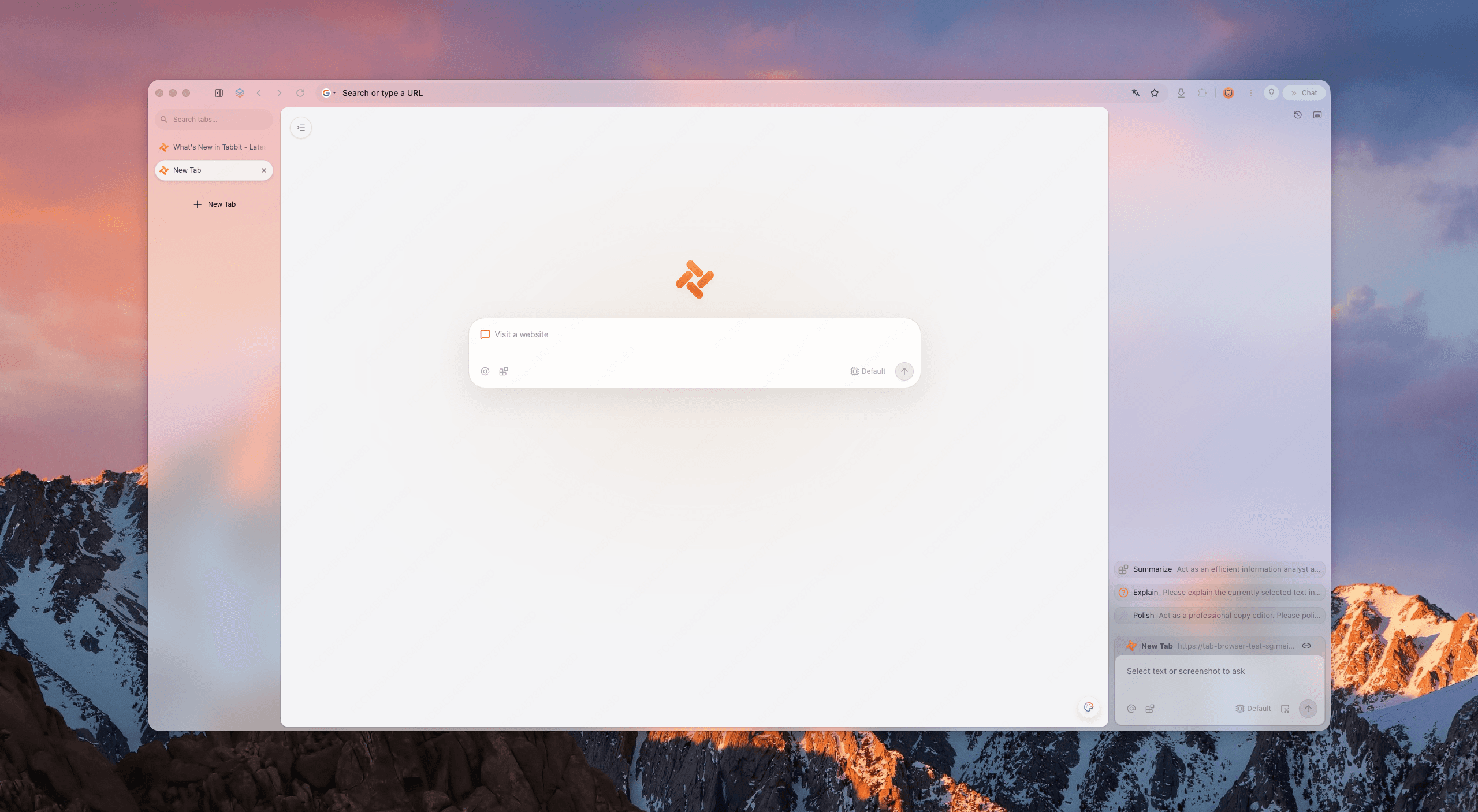
Tabbit ships a vertical tab sidebar with full titles and a search field at the top of the list. Open pages stay a scrollable index instead of a favicon row. Agent tasks run in their own tab groups, so a long research run does not land in the same list as the page you are reading.

Tabbit Browser window with a left vertical tab list, central Omnibox, and an AI panel
Tabbit keeps open pages in a vertical sidebar so titles stay readable while the current page uses the rest of the window.

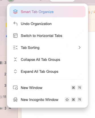
When the pile is already mixed, open the tab-management menu and run Smart Tab Organize. Tabbit proposes topic groups. You still rename the wrong ones. You still pull a live form out before you collapse anything. The AI tab organizer page is the longer version of that limit.

The same menu includes Switch to Horizontal Tabs. Treat the layout as a per-window tool. Use the side list for the research window. Flip the demo window back to a top bar.

Tabbit menu showing Smart Tab Organize, undo, switch to horizontal tabs, sorting, and group collapse
Smart Tab Organize is a first pass. Switch to Horizontal Tabs is there when a window needs the full width.

After groups exist, type @ in the Omnibox and reference the whole group. Ask for a comparison or a source map without pasting twenty URLs into another chat. Organization becomes context for the next task, which is the part a side list alone never did.

Tabbit is the wrong first move if you have twelve labeled tabs and can already find the next page. It will not lower RAM for the same set of heavy sites. Smart grouping misreads vague titles. Keep your current browser profile until bookmarks, extensions, and a couple of critical pages have been checked; the Tabbit vs Chrome page lists those trade-offs.

Which layout fits which job

SituationUse this layoutWhyWhat it will not fix
20+ tabs, titles already truncatedVerticalYou can read and scroll namesDuplicate pages and "read later" hoarding
Ultrawide, one maximized windowVerticalSide padding becomes a useful railA site that is itself a wide app
Two windows split on one screenHorizontal, or a collapsed sidebarWidth is now scarceFinding a tab in the other window
13-inch laptop, 8 clear tabsHorizontalThe top bar is already readableNothing worth a layout fight
Research plus a live form plus mailVertical, with pins and groupsPins stay put; groups collapseUnsaved form state if you close the tab
Recurring client or courseVertical inside a workspaceThe list returns with the projectA workspace you never close
Firefox hover keeps firingVertical, but pin the sidebar or change hoverKeep the readable list, drop the twitchy collapseClaiming the layout itself is broken
Mixed pile across several projectsVertical in Tabbit, then Smart Tab OrganizeFirst draft of groups plus readable titlesMisclassified pages; you still edit

Final verdict

Are vertical tabs better? For tab-heavy desktop work, yes: when the top strip has become icons, a side list is the layout that still behaves like a list. For a short working set, a narrow pane, or a window that needs width, no. Keep the top bar. Chrome, Edge, Firefox, and Vivaldi can all do the switch now. Safari is still the odd one out if you want an always-on strip.

If titles are the only problem, turn on native vertical tabs in the browser you already have and give it a few days in one real project window. If the problem is titles plus a mixed pile plus projects you resume tomorrow, install Tabbit Browser, import the session, run Smart Tab Organize once, and keep Switch to Horizontal Tabs for the windows that need the canvas. Readable names are the start of the workflow. They are not the whole system.

FAQ

Are vertical tabs better than horizontal tabs?

They are better when you keep enough tabs that the top strip turns into favicons. A side list keeps titles readable and uses leftover width on a wide monitor. Keep the top bar if you only keep a handful of tabs, work on a narrow laptop, or split two windows side by side.

Does Chrome have vertical tabs now?

Yes. Google shipped native vertical tabs in Chrome in April 2026. You can right-click the tab strip and choose Show Tabs Vertically, or change Tab position under Settings, Appearance. Older guides that say you still need an extension are out of date.

When should I use vertical tabs vs horizontal tabs?

Use a side list for research, shopping comparisons, and any session where you must read titles. Use the top bar for a short working set, a design file that needs width, a presentation, or two documents parked next to each other. The better layout is the one that matches that window, not a permanent identity.

Why do Firefox vertical tabs keep expanding on hover?

Some Firefox users report that the collapsed sidebar treats nearby empty space as a hover target, so the list pops open when the pointer is not on the tab bar. That is an implementation bug in expand-on-hover, not proof that a side list is a bad idea. Edge users in the same threads often say the hover target there is tighter.

Do vertical tabs use less memory?

No. Moving the tab strip to the side does not unload pages. Memory still depends on the sites, extensions, media, and whether the browser sleeps idle tabs. If RAM is the problem, diagnose the heavy page instead of switching the layout.

Does Safari have vertical tabs like Chrome?

Safari can show Tab Groups in a sidebar, which is a related idea, but it does not ship the same always-on vertical tab strip Chrome and Edge document. If you want a persistent side list of every open page, Chrome, Edge, Firefox, Vivaldi, or a workspace browser is the closer match today.

Take the next step

Let Tabbit work alongside you.

Research across tabs, automate repetitive browser work, and keep every piece of context within reach.